Fennario / Brand Identity / Packaging / Web Site
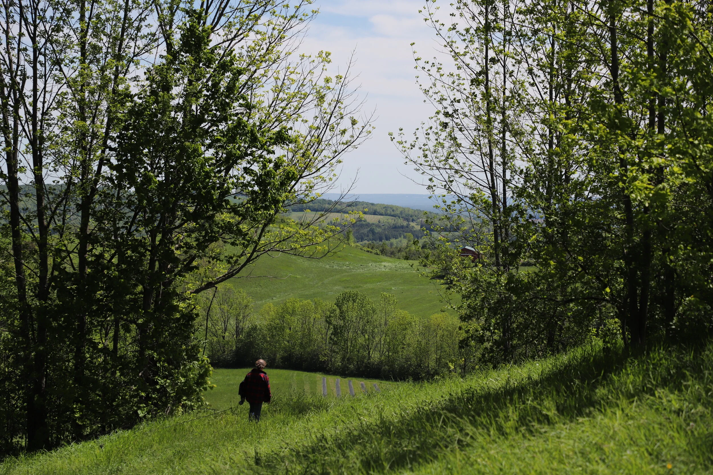
Fennario Meadows is a 100-acre working farm in Ontario with a focus on growing and processing lavender. Close to Creemore, with the Bruce Trail as its western boundary, the land is a stunning blend of plateaus, meadows and ravines that seamlessly join traditional farmland.
In 2019, a plan was created to maintain agricultural stewardship of this land with economically viable values. In 2021, this carefully considered revival was enhanced with the introduction of a wide array of lavender and wildflower pastures, and the restoration of the rose gardens that were originally introduced in the mid-1900’s.
When Design Holmen was asked to create a brand identity for Fennario, the first thing we did was take a deep dive into the competitive landscape. It was VERY purple out there, leaning heavily on origin stories and lavender themes and colours. We saw an opportunity to allow the brand to grow beyond the lavender. By embracing the idea of a meadow we left the door wide open for the farm to be more than a traditional lavender farm. The brand identity that grew out of this thinking was unabashedly maximalist, rich with textures, floral patterns, and the feeling of a day in the warm sun. The final result was a joyous ode to all things pastoral and floral.
As a strategy, we divided the brand into a product brand, Fennario, and a place brand, Fennario Meadows, as a way of creating two separate but connected experiences. One on the shelf and one for visitors. This way products could live on their own but also be supported with a “place of origin” that spoke to quality and added an element of storytelling, ultimately encouraging someone buying a Fennario soap to visit Fennario Meadows where that soap was made.
Project Collaborators:
Jim Muzyka, Donna Muzyka, Michael Esteras, Dan Perrella, Clare Chow, Executive Agency (web development)


